

 Copied to clipboard
A dashboard is more than a collection of charts and numbers. It’s a decision making tool, and the way it’s designed can either empower teams to take the right action or overwhelm them into inaction.
The truth is, humans aren’t wired to process endless rows of data. Our brains look for patterns, simplicity, and context. If a dashboard doesn’t provide that, it turns into noise instead of clarity.
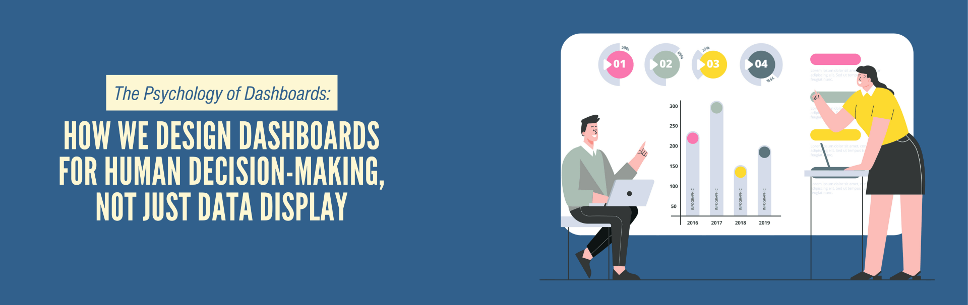
Why Psychology Matters in Dashboard Design
Every number on a screen tells a story, but how we present it determines whether people actually understand it. Research on cognitive load shows that too much information reduces decision quality. A cluttered dashboard with every possible metric might look “comprehensive,” but it paralyzes users.
On the other hand, dashboards built with human psychology in mind highlight what matters most. They guide the eye, reduce friction, and frame data in a way that supports action.
Key Principles We Apply in Dashboard Design
- Visual Hierarchy: Not all numbers carry the same weight. We place key performance indicators (KPIs) front and center and secondary data in supporting views.
- Color Psychology: Colors aren’t decoration. A red spike triggers urgency, while green reinforces progress. Used correctly, colors drive attention where it’s needed.
- Context Over Raw Data: A number without context doesn’t help. For example, “Revenue: $2M” means little until it’s compared to last quarter or benchmark goals.
- Simplicity and Flow: We design dashboards to be scanned in under 30 seconds. If it takes longer, it’s not a dashboard; it’s a report.
Designing for the Human Brain, Not Just the Business System
Too often, companies focus on dumping all available data into a single screen, forgetting that dashboards are meant for people, not machines. When we build dashboards, we start by asking, “What decisions should this dashboard enable?”
From there, every design choice, layout, metric, color, and label is guided by the psychology of how humans interpret information under pressure. Because if your team can’t make sense of the data, it doesn’t matter how much of it you have.
The Bottom Line
Dashboards aren’t about displaying data; they’re about shaping better, faster decisions. By designing with human psychology in mind, businesses understand the real value of their data: clarity, focus, and action.
Are you ready to transform your dashboards into true decision-making tools? Let’s talk about building one designed for the human brain.
RELATED Articles
Most businesses treat their website like a design project. Something that needs

AI sounds exciting in theory, but in reality, most businesses struggle to

Your website should guide visitors, provide value, and turn traffic into leads

Businesses today rely heavily on IT systems to manage operations, support teams,
High-performing websites rarely succeed because of how they look alone. They perform

Small teams thrive on flexibility. They solve problems quickly using spreadsheets, quick