 Copied to clipboard
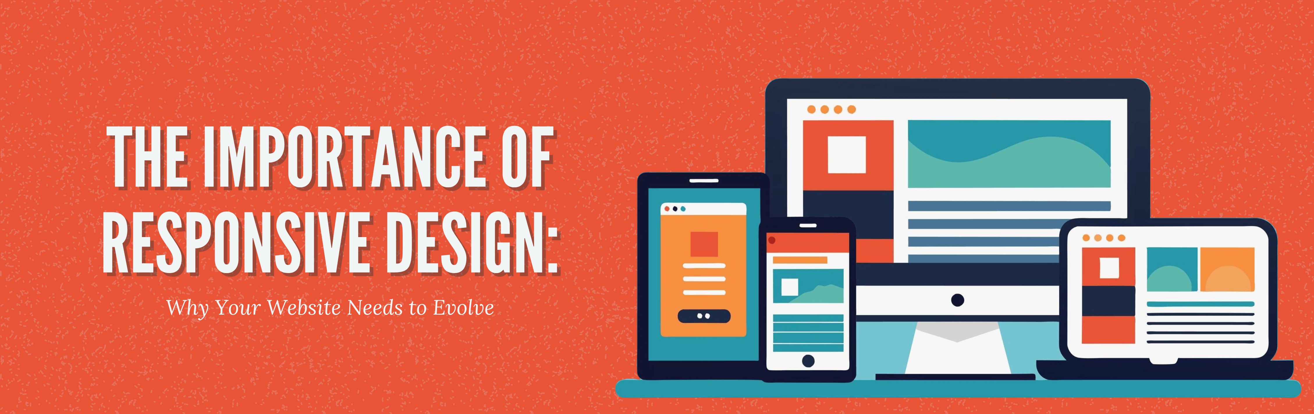
Mobile Usage is Skyrocketing: Is Your Website Ready?
With 58% of global web traffic now coming from mobile devices, businesses must adapt to the growing trend of mobile browsing. Whether customers are shopping, browsing, or seeking information, they are increasingly using mobile phones and tablets to engage with brands. A website that isn’t optimized for mobile creates a frustrating user experience with inconvenient pinch-zooming and horizontal scrolling. The result? Lost opportunities. By adopting responsive design, you ensure your site seamlessly adapts to any device, delivering content in a user-friendly format.
Enhancing User Experience: Why a Responsive Website Matters
The success of a website largely hinges on its user experience (UX). In a competitive online marketplace, even a few seconds of delay or difficulty can drive potential customers away. In fact, 53% of mobile users will leave a website if it takes longer than three seconds to load. Responsive design improves not only loading speeds but also navigation, ensuring that users don’t face disruptions or challenges, no matter their device. A clean, easy-to-use site keeps visitors engaged, encourages them to stay longer, and increases the likelihood of conversions. For decision-makers, this highlights the direct correlation between user experience and business growth.
SEO and Mobile-Friendliness Go Hand in Hand
Beyond user experience, responsive design plays a crucial role in search engine optimization (SEO). Google and other search engines now prioritize mobile-friendly websites in their rankings. If your website isn’t optimized for mobile, you could lose out on both mobile traffic and visibility on search engines. Research shows that 61% of users are unlikely to return to a site if they had trouble accessing it on their mobile device. If you’re struggling with SEO or want to rank higher in search results, responsive design is the solution that aligns your website with Google’s ranking criteria.
Stay Competitive in Technology and Design Trends.
Technology is evolving rapidly, and so are web design trends; even a website built five years ago can feel outdated. Businesses that fail to adapt risk becoming irrelevant as users flock to competitors with sleek, modern websites. Responsive design allows your website to evolve with changing technologies and screen sizes automatically. Whether it’s the newest smartphone or an unexpected design trend, your site remains fresh and functional without needing constant redesigns.
The Cost-Effective Solution: Save Time and Money with
Responsive Design
While many decision-makers might hesitate to invest in responsive design, the reality is that it’s a cost-effective, long-term solution. Maintaining separate desktop and mobile versions of a website requires more resources, time, and effort. A responsive design eliminates the need for these multiple versions by creating a single site that adapts to all devices. This streamlined approach reduces ongoing maintenance costs and ensures a consistent experience for users, no matter how technology changes. The initial investment in responsive design pays off through reduced updates and higher customer satisfaction.
Meeting Consumer Expectations: Why Instant Access is Crucial
Today’s consumers are more demanding than ever. They expect quick, convenient access to information, products, and services, and they won’t tolerate delays or obstacles. Research shows that 88% of consumers are less likely to return to a site after a poor experience. If your website isn’t responsive, you risk alienating potential customers, who will quickly move on to a competitor that offers a smoother experience. By adopting responsive design, you meet these heightened expectations, providing instant, hassle-free access that keeps users engaged and returning for more.
Future-Proof Your Business with Responsive Design
Responsive design is not only important but also equally necessary in the digital world. With the rise of mobile usage, the focus on user experience, the importance of SEO, and the need to keep pace with evolving technology, businesses without responsive websites are falling behind.
As a decision-maker, if you’re looking to refresh your company’s website or improve its UI/UX, investing in responsive design is the smart move. It’s a future-proof solution that ensures your website stays relevant and competitive. Are you interested in learning more about how responsive design can benefit your business? Contact us for tailored UI/UX solutions that deliver results.
RELATED Articles

Your website should guide visitors, provide value, and turn traffic into leads

Businesses today rely heavily on IT systems to manage operations, support teams,
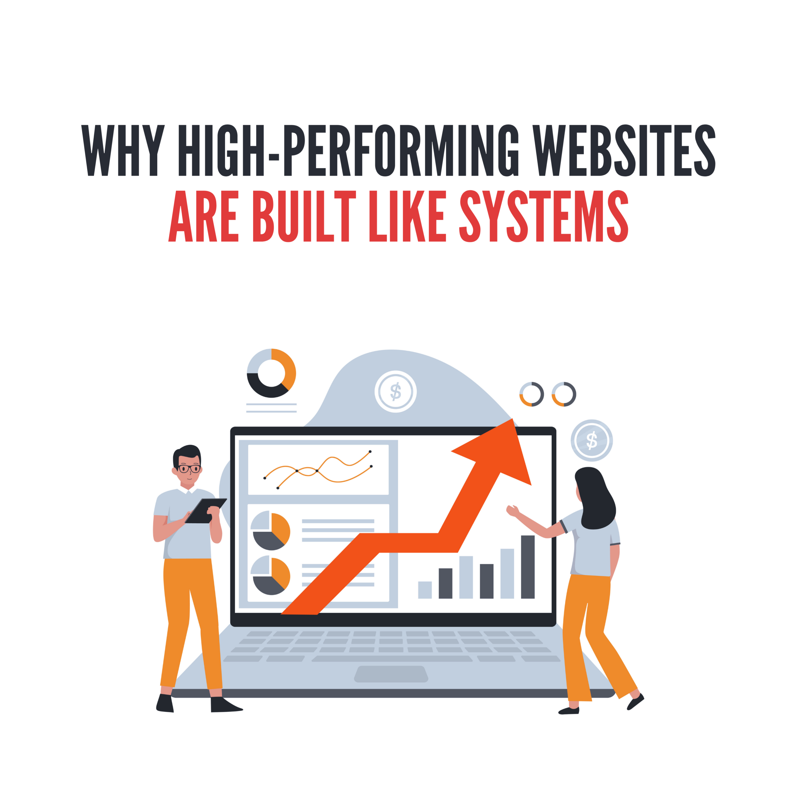
High-performing websites rarely succeed because of how they look alone. They perform

Small teams thrive on flexibility. They solve problems quickly using spreadsheets, quick
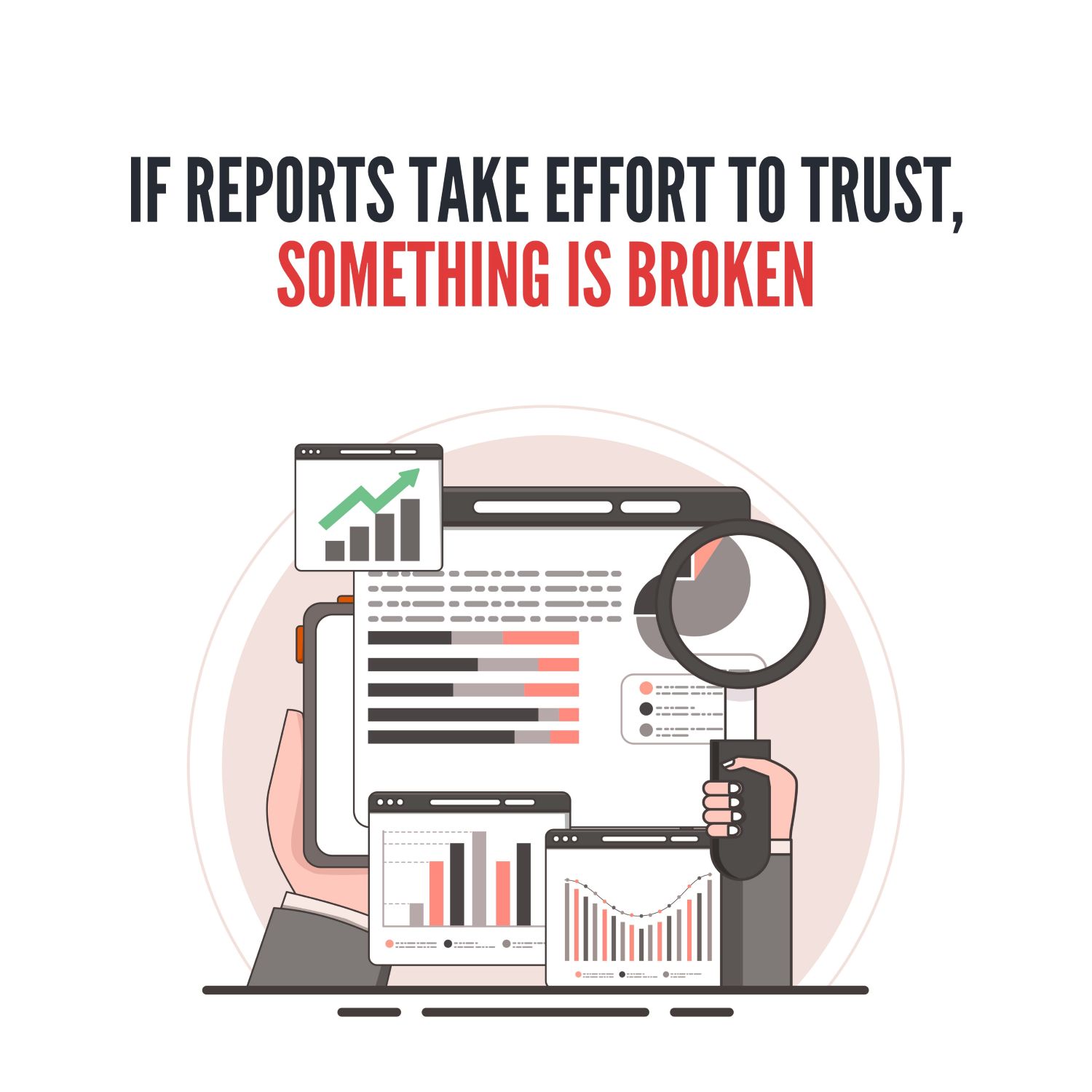
Most leaders aren’t short on data. What they struggle with is trusting

In the early stages of a business, software usually feels like it’s