Dashboards are critical when it comes to decision-making in many organizations. They offer a snapshot of key metrics, helping teams and leaders act fast and stay aligned. But not all dashboards do their job well. Some overwhelm, confuse, or even mislead users. If your dashboard isn’t delivering clear, actionable insights, it might be time to look closer at what’s holding it back.
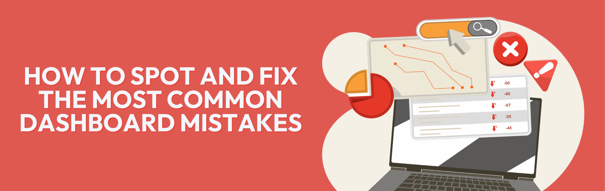
Common Dashboard Mistakes to Watch Out For
Overloading with Too Much Data
A common pitfall is cramming every possible metric into one dashboard. When users face a flood of numbers, it becomes hard to focus on what truly matters. Simplicity drives clarity.
(Source: TableauBestPractices)
Poor Data Visualization Choices
Choosing the wrong charts or graphs can misrepresent data and confuse users. For example, pie charts aren’t great for comparing many categories, and 3D effects often distort perception (Source: HarvardBusinessReview).
Ignoring User Needs and Context
Dashboards aren’t one-size-fits-all. What’s useful for a CEO won’t be for a sales rep. Ignoring the specific needs of different users can make dashboards irrelevant or overwhelming.
Neglecting Real-Time or Updated Data
Outdated dashboards can lead to poor decisions. If data isn’t refreshed regularly or automated updates aren’t in place, users may lose trust in the dashboard’s accuracy.
(Source: PowerBI Real-time Data)
Complex or Confusing Layout
When a dashboard lacks a clean, logical design, users spend more time figuring out how to read it than analyzing insights. Overlapping sections, inconsistent colors, and random placements add to confusion.
Lack of Clear Actionable Insights
A dashboard should do more than show data; it should guide action. If users can’t tell what steps to take next based on the dashboard, its value drops significantly.
Ignoring Mobile or Multi-Device Accessibility
Teams increasingly rely on multiple devices. Dashboards that don’t adapt to mobile or tablets miss out on important engagement and can frustrate users on the go.
How to Fix These Mistakes: Best Practices
Simplify and Declutter Regularly
Cut the noise by focusing on key metrics. Regularly audit your dashboards and remove outdated or irrelevant data points.
Choose Appropriate Visualization Types
Match your data story to the right charts. Use bar charts for comparisons and line charts for trends, and avoid misleading visuals like 3D charts.
Focus on User-Centric Design and Role-Specific Dashboards
Create different versions of dashboards for different roles. Understand what each user needs to see and act on.
Automate Data Updates and Include Alerts
Set up automatic refreshes and push alerts for important thresholds to keep everyone informed with up-to-date information.
Create Clean, Intuitive Layouts with Logical Grouping
Group related metrics together, use consistent colors, and keep the interface straightforward so users can quickly find what they need.
Highlight Actionable Insights Clearly
Use callouts, color codes, or notes to indicate which numbers require attention and suggest next steps.
Design for Multiple Devices
Make sure your dashboards look good and function well across desktops, tablets, and smartphones.
Building Dashboards That Drive Results
Growth is exciting, but it often reveals the limits of your current tech. More customers, more employees, more data, and suddenly your software struggles to keep up. You might catch yourself adding “just one more app” to fill the gaps, but the problem only gets bigger. When your tools start holding you back instead of moving you forward, it’s time to consider software built to grow with your business.
Need Help Building or Fixing Your Dashboards?
If your IT team is constantly fixing broken integrations, tracking down bugs, or managing outages, it’s a red flag. Temporary fixes might work for now, but over time they drain your time and resources. This cycle slows down innovation and distracts your team from more strategic work. Instead of putting out fires, your IT should be driving growth and improving systems. When maintenance eats up most of your time, it’s time to rethink your approach
At Devfinity, we specialize in creating dashboards that bring clarity and drive results. Our experts work closely with your team to design, develop, and fine-tune dashboards that fit your unique needs, making complex data easy to understand and act on.
Let’s talk about how we can transform your dashboards and power your business decisions. Book a consultation today!
RELATED Articles
Websites now serve as dynamic hubs where businesses connect with customers, showcase

For years, Excel has been the go-to tool for business reporting. It
Many businesses invest in websites but still struggle to convert visitors into

Is your team spending too much time on repetitive tasks, struggling to
Data has always mattered, but 2026 will mark a turning point. It

Technology moves fast, and 2026 is shaping up to be a year